Monday 3 March 2014

BCN MCR Exhibition & Contacting Dave Sedgwick

BCN MCR Exhbition & Contacting Dave Sedgwick

Over the past few weeks I have been in contact with a graphic designer called Dave Sedgwick from a Manchester studio. I have received invaluable advice about approaching designers and he has give me so many good resources for inspiration and information into upcoming events. I will be arranging a studio visit when I have a better body of work together so I guess I'm making some progress nice and early. 


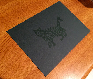
Having recently contacting him again he told me about an exhibition he is organizing over at TwentyTwentyTwo in Manchester, a graphic design exhibition featuring a selection of Design, illustration and typographic studios from Barcelona. I was lucky enough to receive one of the limited runs of the letterpress invites he was creating for other graphic designers so I felt extremely privileged to receive one of these.


The exhibition 
Went down to manchester to see the exhibition, really annoyed with myself for not going on the opening night as I missed the opportunity to buy some 1 off prints from so many great designers and agencies. 

I have to point out how much I love the promotion behind the event ranging from the invite card I received to the simple mass produced flyers scattered around with details on how to purchase prints.

Dave has a very unique style mixing bold use of block colours and ornate decorative type to draw lots off attention in, theres a lot of contrast that goes on in this flyer making a simplistic layout appear quite complex. Gives off the illusion theres a lot more going on. 

Another designer I have started to follow after this exhibition is Laura Mesequer, a freelance type designer based in Barcelona who had strong involvement in producing the BCN MCR type that was used to brand the whole exhibition. Here are large scale one off prints of these letterforms, so beautifully and accurately created with a whole different range of styles and aesthetics showing off her versatile design style. I especially like the "2", its contrast in weight is so drastic working alongside sharp angles and smooth curves I feel this contrast is what causes the high impact aesthetic. 

An agency I have been interested in for a while now also had some work up, these are the ones I would have liked a print from. Brosmind are an image based duo who are so playful and care free in there work. You can tell there style a mile off, so uplifting and humorous. This example here is one of the original drawings before digital production, the level of craft and detail in there analogue drawings is amazing.

 Here are some other examples of type design I liked in the event. This use of signage on the way in sort of sets the scene for the quality of the design work inside the building. 

Love this example, the 3D effect from a flat image and simple use of 2 colour is cool. Love how type can be so image based while remaining relatively simple. 

Conceptual rap

Conceptual rap

To get us thinking more out of the box we were placed into groups of 4 or 5 and chose weather to create a rap or a poem based on concepts. 

Concept comes first when you can't think of one its the word.
Thinking of no more than one idea is our worst idea.
Remember do your research, wether its individual or team work.

We performed the rap in front of the group, and its certainly something I will remember. Pretty embarrassing. 

Manafisto & Design Task

Manafisto & Design task

Today we had a brief insight into what we need to prepare for by the end of the 3rd year. Two 3rd years from very unique disciplines delivered a presentation of there manifestos for the creative practice. A brief insight into a manifesto is the basics of you as a creative.

Its the declaration of your intentions for your creative practice.

What I'm into.

What makes me and my style unique.

What do I do or what do I intend to do?

What do I believe in?

We were then paired up with a peer to create a collaborative manifesto. We began discussing our own personal attributes and what makes us who we are and what we believe in (a brief personal manifesto) and then compiled what we agreed on as a collective. Here is a brief run down of our manifesto (Neill & Jonny)

We use traditional Graphic Design process. (Grid systems, Hierarchy, typical development process etc)

We prefer design work with good concepts rather than pleasing aesthetics, although aesthetics are equally important.

We are very image based with our designs having both come from a fine art & illustration based background.

With printed media we feel that paper stock is a crucial choice within the design production process. 

And Cats are better than dogs, just because dogs are evil. 

This manifesto will be mine and Nielles personal guidelines, we are both to produce a piece of graphic design sticking to this manifesto as a base for our practice. The piece of graphic design needs to be something so good that the receiver would treasure it forever.

The receiver been Ian Anderson, the founder of Designers Republic. This task has lots off opportunity for recognition due to Ian's success within the industry and his links with other designers.

Design outcomes
Here is a piece of design that follows the guideline's of my manifesto. 

It uses traditional graphic design process's in the form of typography and imagery but with an abstract more illustrative twist to emulate the image based designs I like to produce. 
Producing a physical print that you can hold is something that simulates traditional graphic design rather than producing just a digital image it combined both digital techniques with traditional techniques. 
The centre use of space simulates considered layout within balance of negative and used space within the composition. 
The concept is based on the playfulness of cats demonstrated through the illustrative use of typography to create an image.
The use of typography has abstract use of hierarchy too, the viewers eye is bounced around the letterforms through abstract alignments, sizing and distortions with contrasting more legible fully readable words. 
I experimented with paper stocks which completely altered the aesthetics and colours of the design, the design document was green ink but when printed on a dark stock it looked like a sort of UV printing technique which was an interesting outcome. I much prefer the beige and the grey stocks they contrast nicely with the green ink.  
The image itself is based on cats, I felt this would be a good image to use as one of the points I made as a comical reference was my preference to cats over dogs. It also gave me the opportunity to experiment with typography in an abstract way to produce something quite image based and playful in aesthetics.

I think this could be taken further by screen printing the images to demonstrate more traditional design process's.