Monday 11 April 2016

Alan Kitchin, Ian Anderson & Danny Leigh Talk's

Alan Kitchin, Ian Anderson & Danny Leigh Talk's

Obtained a ticket for the Print Festival talk and had a great day and come out feeling very inspired and educated from a number of creatives and professionals who approach and appreciate a range of subjects, showing how multiple disciplines can come together to create a very well informed delivery of subjects.

The overall theme was obviously print so it was nice to hear such a varied number of opinions from different practitioners and has certainly informed my thoughts too the process.  I took a number of notes and formed a few opinions from them to take foreword. 

Ian Anderson
As long as the outcome is off screen Ian considers the outcome as print based, this is his focus on the print process. Anything away from the screen. 
The process doesn't have to be as organic and messy as screen-printing, letterpress or purely hand on crafts.
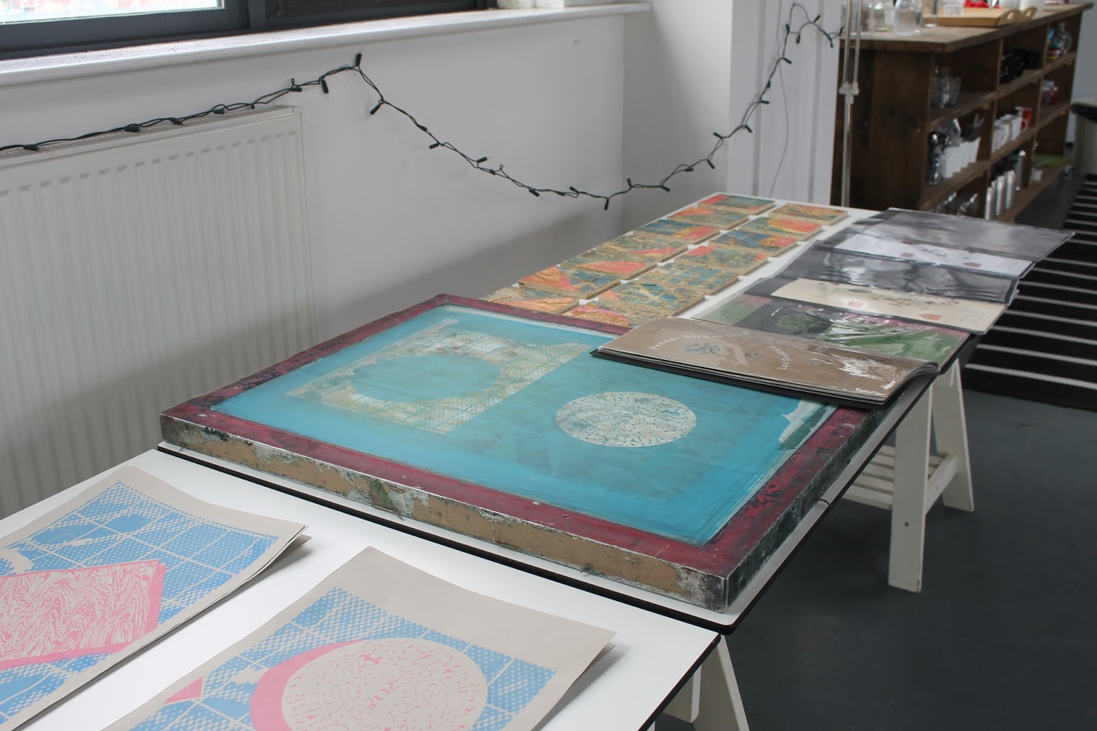
Screen print is now trying to replicate digital print, losing its character it once had, its tactility within imperfections and the idea of happy accidents, I fully agree with this statements and the accidents from slight bleeds too offsets and miss registrations is what makes this process so appealing to me. 
The idea of controlling a glitch and the idea of using mistakes within even digital print process's creates a repurposing of these past print happy accidents. 
Less is more is an excuse for minimal thought process and asthetic application, I fully agree here I used too be very minimal in my approach but now I like too add a variety of process's and visuals as I feel each individual entity can strengthen a whole design outcome. 
Repurpose a design output to your own, add your own technique to screen printing, im trying this at current with the incorporation of digital screen printing, merging digital and screen printing together through a lot of my work. 

Danny Leigh
Talking about film posters and there context.
1983 Fly posters pasted on boards on abandoned London houses, creating a certain aesthetic within run down areas in London. 
Original film posters focused on promoting an experience, not snapshots of the scenes of the film. I agree with this, theres an element of interaction lost within poster design and I feel its through the detachment through digital technologies. 
1950s introduced the idea of taglines bringing in marketing techniques taking it away from been pure visuals and started to apply the use of language and added context to support the visuals, showing real thought process's in every stage of making a poster. 

Alan Kitchin
This talk will go on to influence one of my most substantial projects within EP. See here.
His ideas on if he doesnt own it he makes it resonates with how I want to make a laser cut typeface that shows the limitations of letterpress. 
Influenced by the Bahaus. 
Albertus is the most used typeface, consider this when repurposing a typeface synonymous with the mass distribution of information as an expansion of my COP within EP.
Multiple collaborations with Monotype, showing there appreciation too there origins through the collaboration with an artist that uses the origins of type distribution as his sole practice.

Got his email to send him my letterpress project and a signed book too:) 

Friday 1 April 2016

EQUIP - Studio Plans Plans Plans

EQUIP - Studio Plans Plans Plans

Me and Joe put together a business plan providing a run down of basic costs, predicted incomes and our current plans as a collective for the year and after this year. 

EQUIP - Website

EQUIP - Website

A simple continuous page website was created too act as a visual collation of all our work, with a sub page acting as a blog for our creative influences and our day to day activities. We felt it was important to show what goes on behind a creative agency that is just starting up, its honest and adds an insight too what influences there creative practice. Rather than just a presentation of there work and no context or meaning too who designs it.

Obviously keep things clean but references too music and day activities can show outside influence, this will help when it comes too clients who dont fully understand the full creative process's if they can relate to something your interested in or see your interested in real life things it will give them more confidence in the brand. 

The alteration of black backgrounds and white photoshoot backgrounds shows the contrast in approaches and possible resolutions we offer, ranging from conceptual branding too research projects too experimental and contemporary print outcomes showing a full breadth of work in a simple set of formats. 


EQUIP - Identity & Positioning

EQUIP - Identity & Positioning

Branding
In terms of physical identity we chose to just produce a business card as we still havent settled within an area. The business card will just be a keepsake to remember our name from when we feature at events or exhbitions, prople will be drawn in by our exhbition pieces and visual manifesto. A main touch point of our brand. 

The logotype is Clarendon bold, the e has a look and feel that reminds us of the internet while the rest of the serif font has quite a contemporary feel while the large angular serifs add a robust feel too a traditional serif. A nice contrast of process's which resonates our appreciation too print and digital process's while the delicate calibre regular references our attention to detail even within our experimental process. 

The printing of a black and white triplex business card works on the idea of contrast, ranging from our contrasting process's too the services we offer. 

The main focus of our brand is the visual manifesto, this works alongside our idea of progression. Something we add too as we progress as a studio referencing our 8 point manifesto at all times but as we touch a lot of areas within print and design we need a brand that can be delivered across all these. And this works as an exhbition piece, a promotion piece and an example of what can be achieved at our workshops. 

In terms of positioning we sit within an experimental print, aiming at filling a gap in the sector for print services ranging from riso-graph to screen printing as an end goal but at current we offer graphic design solutions that focus on the distribution of typography and image through digital and print based process's. 

Moo Order
We printed the cards from Moo as there business model is something we appreciate and aspire too, an end goal would be too reach such wide recognition as these but still pay attention to detail to quality print process's and allow a range of creative process's to be chosen by the customer at reasonable prices. 

EQUIP - Screen Print Workshop

EQUIP - Screen Print Workshop

Kaws Screenprint Workshop
To learn a little bit on how workshops worked we went to the Kaws Screenprint workshop at YSP, for £6 it was hard to say no!

What we learnt from this and what gave us confidence was;
Theres no rush, people are prepared to wait. 
Use pre cut templates for people who dont feel comfortable creating complex shapes. 
Fabric screens dont dry up!
Have a system for screens using different colours, have a sort of circle going on so the people at the workshop can cycle through the colours they like. 
If we get some beds with hinges this keeps everything clean and tidy and less clumsy. 
Have a set number of colours, keep things simple. 

Preparation
For people wanting to create complex patterns but not confident to use the knifes, a number off laser cut templates where made in bulk, these could then be cut up and combined with other shapes to create more complex patterns.

We didn't want people to feel disappointed so we wanted to give them a full range of options when it came to what they could make, from textured gradients too fluid shapes too accurate geometrics. Combine these with there own shapes and a nice set of possibilities arise. 


We wanted to do it on a budget with it been our first so we stuck to A4 screens, this kept things simple and less daunting for first time printers too. The first screen we bought was a cheap wooden one and the fabric a little flimsy, we tried a stencil idea from the KAWs exhbition and the bad quality screen bled through. 

Getting to terms with cutting stencils for screen-printing as we were used too exposing screens, it didn't take long and we were able to start making complex shapes and patterns and really enjoying the process. 


We found that magazined where an ideal material for stencils, the glossy finish allowed a more robust application when it came to the repeatability of the stencil, allowing around 15-17 prints too be made before the paint started bleeding. An important consideration at this stage was to keep the paint very opaque with lots of binder to stop the screen drying, we needed to get 4 hours worth or printing out without the screens drying. 


After the end of 2 days of testing we where fully happy and ready to go, confidence was the key here as we was printing for 4 hours we wanted to know everything would run smooth and with it been our first workshop we did not want to fail before we even begun. 

Promotion
The tickets were promoted through the Leeds Print Festival Website and Creative review, distributing the Equip name out on a large scale, some great exposure for us especially for our first workshop. 


The Day
The 4 hour day would consist of a quick 15 minute talk and explanation of the day and the process, with a guide round the tables and talk about the colours available and guide them round the tables and talk through the stencil process from drawing out the pattern too the cutting too the printing. 

We had work on show to show the possibilities of screen printing with exposed screens both on wood and on paper, we wanted people to take this on as a hobby at home so showing them where this could progress too shows them the future potentials of this process. 


Again thank you to Leeds Print Festival for the opportunity to run our first workshop, it was good for all the tickets to sell out and see everyone pleased with there outcome. Really pleased with what work people came out with to say a lot where first time printers, some nice detailed prints and good use of colour while some produced editions of 20 showing that the stencil system was robust and accurate enough for high volume printing. 

 Another foot foreword for another touch point of our business.