Wednesday 10 February 2016

EQUIP - Jigsaw Finals, Rationale, Manifesto & Evaluation

EQUIP - Jigsaw Finals, Rationale, Manifesto & Evaluation 

Jigsaw Finals & Rationale
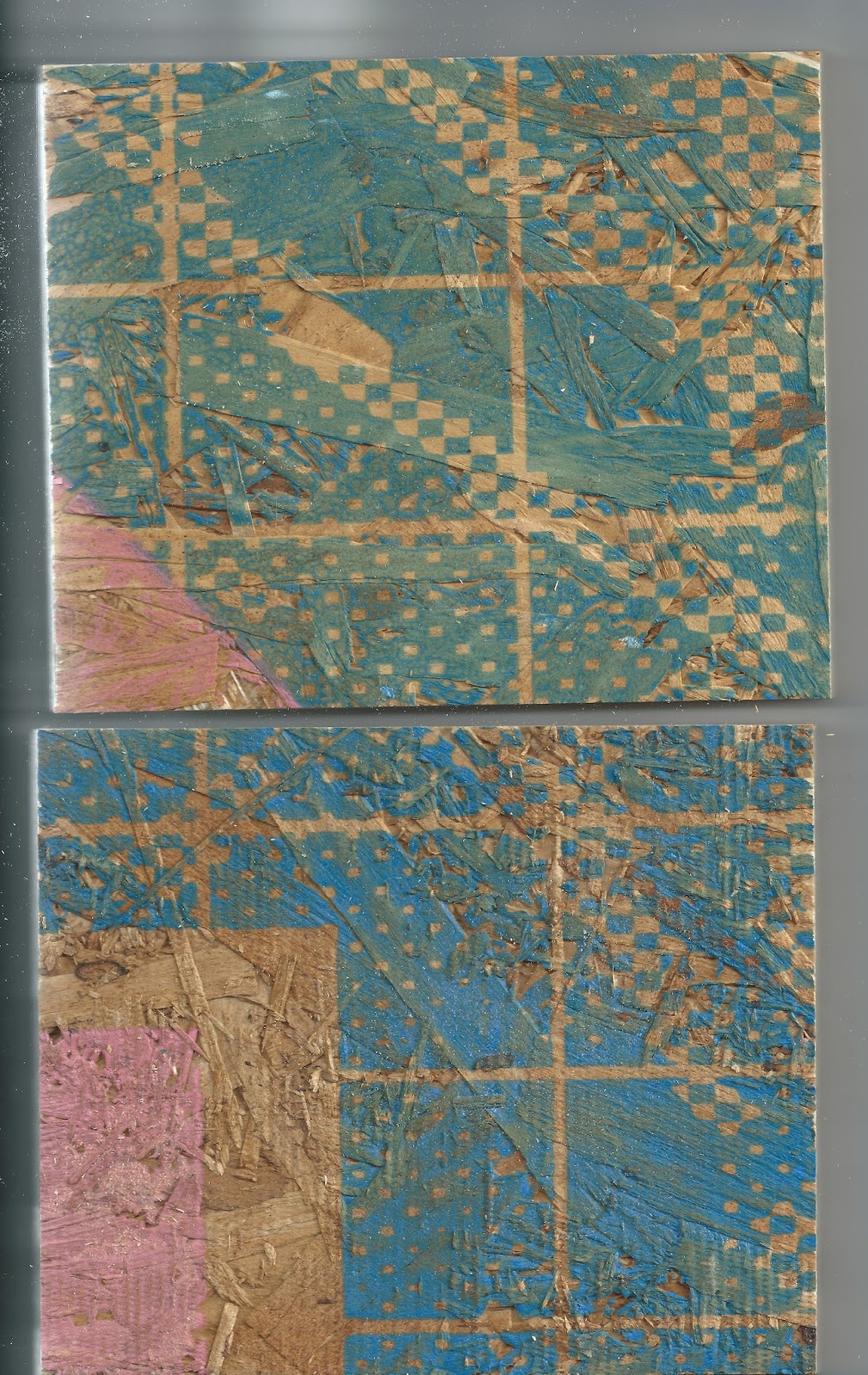
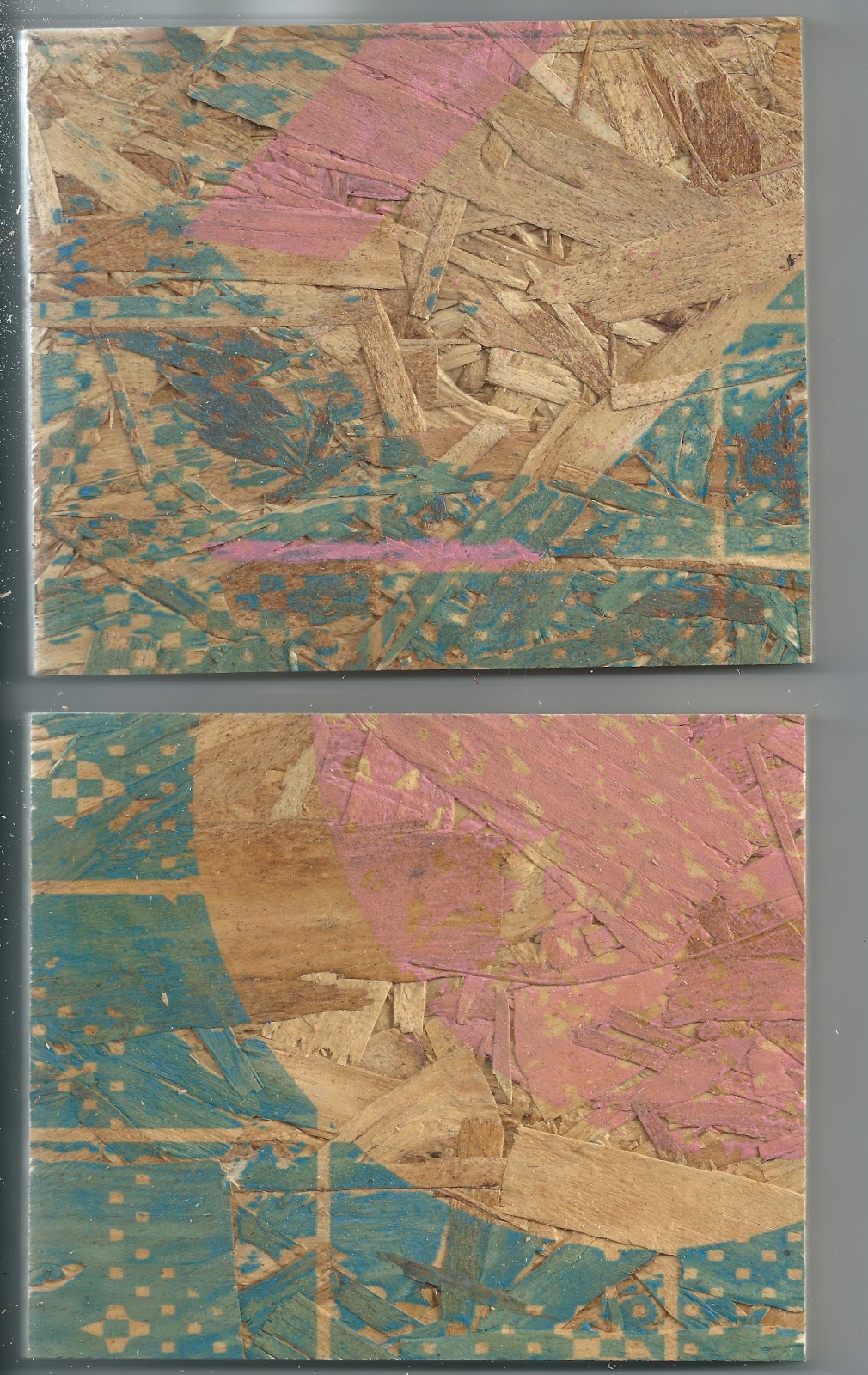
The original intentions of these pieces was to carry our manifesto within a physical output that references our appreciation of print and technology process's, the idea was to split the wood up into 4 pieces each, creating a representation of our manifesto.

The idea was too create illustrations and typographic additions using a multitude of process's to reference our practice, ranging from hand rendering too vinyl sticker too further screen-printing.

1 Experimental – type, layout, stock, production 2 Hands on – better word… don’t fuck about 3 Progressive – contemporary, risks, experimental, pastiche 4 Outside influence – better word… graphic design isn’t all that 5 Print – heavy focus, experimental, collecting, aura 6 Digital considerations – awareness, progression, future of design 7 Research heavy – informed, conceptual 8 Nomads of graphic design…. Roaming, avoid settling for the basic

At current though the use of pastel pink and blue references our contemporary approach while the robust and rustic feel of the chipboard shows our tactility and consideration to material and physical process's. The patterns are a collaboration of mine and Joes digital process's mine coming from the scanning in of hand rendered material turning it into a texture and interacting it with basic 3D shapes and a modular grid as a transition from the physical too the digital.

Joes was a number of scanned in pieces of paper repurposed into an intricate digital texture that worked as the base pattern for my layer.

Evaluation & Plans
At current we are happy with our outcome, it really reflects our process and has a multitude of uses that expand away from your typical branding, this is a physical delivery of our process and a snapshot of how we work that will be taken too exhibitions and print fairs as a promotion piece so in this sense it will work perfect in expanding our presence. 

It was a shame we never got round too adding the visualization of our individual manifesto points, but the pieces are an ongoing process, been added too and manipulated as our positioning within the industry changes. We will have the pieces illustrated for print fairs over the summer to begin getting our selves noticed as contemporary printers and graphic designers. 

Im excited too begin creating designs for these pieces, now there isn't such a rush for time I can spend more time on creating quality resolutions that in turn will help show our potentials a lot more, if we rushed them it would make us look of a lower standard of creatives. 

EQUIP - Jigsaw Concept, Development & Production

EQUIP - Jigsaw Concept, Development & Production

My concept for my half of visual contribution
Reference the transition of limitations within traditional communication distributions to the opportunities of the digital cyberspace age using 2D & 3D shapes and typography with the incorporation of experimental analogue and digital textures, pattern and digital manipulation as a reference to my experimental and varied process. 

Scamps
I began creating a number of sketches ready for applying my process too the overall design, the idea is to show the collaboration and the coming together of our shared appreciation to technology and print process's so we agreed to work on an idea of texture repurposed using digital methods as texture has physicality too it in its aesthetics and will carry perfect onto the rustic chipboard. 

I started working on the idea of representing a glitch as a reference too technology, repurposed in repeated forms to create a tactile and textured pattern using basic shapes, organic shapes and angular shapes and line as a reference too traditional print and digital vectors. 


Digital & Analogue incorporation and development
The idea is based on unpredictability, something evident in print process as well as me and Joe as creative, where very experimental so whatever we produce we just adapt and develop on, its a very hands on process that needs reflecting within our visual manifesto. Creating abstract patterns was the first port of call. 

Digitally repurposing too add a more informed random feel with the waved vibe giving quite an organic and fluid feel that supports the idea of print quite well. 

Creating some nice textures too show our approach and attention to detail even when using experimental process's. Through the addition of basic shapes that contrast in tone a contrast of our disciplines and approaches to technology and print can be contextualised.


The use of circles and squares shows an idea of primary principles, showing we start with basic process's but lead it onto an end result that is quite complex. 


Addition of the shapes too the overall pattern, with the grid tying everything together as a whole showing our collaboration and joint process within our working together. The use of white will be negative space to show the wood through to support the rustic feel and our appreciation to material and process interactions. 

Production
First time using fabric screens and printing onto wood so this was a fun little experiment in itself, expanding our skills as screen printers and furthering out knowledge within the practice to allow us to approach projects that use varied materials in the future be it for clients or more personal projects like this. 

Mixing up the pastel pink and blue, aiming for a blue that reflects a digital vibe while the desaturated pastel tone has an organic feel too it, the pastel neon pink purely indulgent and works beautiful with blue and will contrast very nicely with the neutral tone yet robust texture of the wood. This idea of accuracy and robustness further supporting our attention to detail yet physical approach. 
 

Pulling a few screens each, it helped to do multiple pulls due to the irregularity of the wood while adding a lot of weight to the screen to make contact between paint and material. Something we will remember when it comes to doing these kind of jobs professionally.  

The colour darkens slightly, I guess this adds a more tactile feel and supports the robustness of the wood. 

Scanned in to show the digital capturing of our physical outcomes, this will support the distribution of our process when presenting the work online to gain exposure and potential work. 


We created a few test prints to give out at an upcoming print workshop we are holding at Leeds Print festival, we will be taking the wood with us to show the different capabilities of screen printing and how it can be applied to paper and more robust objects. 

EQUIP - Jigsaw Research

EQUIP - Jigsaw Research

A compilation of visual influence that could spark visual outcomes using technological and traditional process's.

Shapes carry pattern and texture very well in visually impact-full ways. The shapes created could be physically made and scanned in to reference a transition of technology, the use of monochrome here could also influence ideas of past print limitations while the textures have a certain grainy digital feel that loosely references bad signal on TV. An interesting concept to work from as a means of emulating cyberspace technologies. 

Gradients to me carry a technology vibe referencing investigations into presets within design software, these mix of colours could be created using analogue image making techniques and manipulated in digital technologies, the framing technique used here would allow a contrast of textures and patterns to be emulated in one image that still maintains structure. 

The monochrome scheme is quite an abstract combinations of textures, the use of monochrome has kept the composition balanced, the textures and shape have a very physical feel too them, looking like they where created or captured as physical things and manipulated digitally to sit flat and within a structured framework, working with 3D imagery in a flat final outcome is an interesting consideration to make when emulating a transition from physical to digital.  

Angles and curves have always carried strong visual connotations, I could use them as a way of showing a transition from old to new, square angles showing limitations of the past and free flowing curves showing the progression and opportunities of the future. While the addition of analogue textures and image making could reference analogue techniques. 

Pastel colours and monochrome shades are something worth experimenting with, pastel shades have quite a modern feel but there muted tones don't have too much of a digital presence to keep a balance of the visualisation of digital and physical principles alongside the digitally manipulated analogue marks. 

The incorporation of messy analogue marks would be a nice way of showing a thought process, all ideas come from rough scamps and are never resolved straight away digitally so even with an entire digital design there is always a hands on process involved within development. 

These examples all have these analogue marks incorporated but the use of digital typography and organised layout show the coming together and development of visual outcomes and the transition of analogue to digital. The limited colour palettes all help to bring this structure in together with the slight colour addition adding a digital finish too monochrome schemes that reference past print limitations. 


These screen prints have quite a glitchy feel, much like the textures and graininess that references a bad signal TV these textures and patterns reference the progression of technology and in this case the limitations but within a print and traditional outcome. Our approach is quite experimental so working off an idea of glitching and such technological limitations like bad signal, something that is quite unpredictable would be a good way of referencing out process as well as referencing technology and tradition.

A mash up of multiple visuals made using a variety of process's show our experimental and open approach to a design outcome. With the first example using very analogue techniques but much of them could reference digital aspects, a grid for example layout guides, the squiggle line and shapes could emulate vector pen and shape tools, the texture the TV signal graininess while the block colours could reference the opportunities of digital.  

2D and 3D shapes are used here, 3D created with the use of texture adding depth to a flat image, this transition of irregular flat 2D shapes and 3D shapes could be a way of showing a technological transition, again the use of monochrome really does help maintain a balanced feel within very different aesthetics and shows past limitations of technology and progression, The use of a very grid based and structured layout is a consideration worth experimenting with when positioning visual elements on the piece of wood. 

Going with abstract aesthetics with a mash up of many medias is a route I will be going down to show our experimental process, how all these visuals are made and positioned will reference digital and analogue process's but the layout itself will further support this transition. Learning from these examples with there use of image making, manipulation, use of colour and layout will aid this. 

The first has a very digital vibe too it but the liquify manipulated shapes and mix of colour have a nice reference to physical paint, the use of colour and background have a complete digital feel however. A nice combination of the both. 

The Henri Matisse poster has a mash up of very angular shapes that have a very cut and paste aesthetic but a digital output with the layout looking like it has been layered and scanned in. A nice reference of technology and hands on process's a perfect representation of our process. 

The final however has a very physical feel too it, looking more like a collage than anything. The images collaged though have a very abstract feel, looking almost like a cubist composition with the incorporation of digitally influenced textures. A great reference to our open ideas of influence.


The use of 3D shape with the incorporation of abstract digitally influences texture reference the physical and the digital with the contrast of blue and monochrome further referencing digital and analogue. The structure and how the shapes created look to be digital too with the layout certainly referencing the structure and abilities of digital but an analogue aesthetic is still maintained, its quite interactive with how it draws attention in. Something very important within our work, maintaining tactility through the use of simple visuals or abstract visuals, its all part of our experimental process and varied approach but still takes strong consideration to communicating with the end user. 

A perfect example of the incorporation of technology and tradition, a laser cut lino print zine.  Using very traditional illustration styles with the incorporation of linear art could be a way of referencing tradition and digital. The limited use of colour also shows limitations of print but the paper stock, construction, format and use of type in the zine references digital layout but in a balanced way.