EQUIP - Jigsaw Concept, Development & Production
My concept for my half of visual contribution
Reference the transition of limitations within traditional communication distributions to the opportunities of the digital cyberspace age using 2D & 3D shapes and typography with the incorporation of experimental analogue and digital textures, pattern and digital manipulation as a reference to my experimental and varied process.
Scamps
I began creating a number of sketches ready for applying my process too the overall design, the idea is to show the collaboration and the coming together of our shared appreciation to technology and print process's so we agreed to work on an idea of texture repurposed using digital methods as texture has physicality too it in its aesthetics and will carry perfect onto the rustic chipboard.
I started working on the idea of representing a glitch as a reference too technology, repurposed in repeated forms to create a tactile and textured pattern using basic shapes, organic shapes and angular shapes and line as a reference too traditional print and digital vectors.


Digital & Analogue incorporation and development
The idea is based on unpredictability, something evident in print process as well as me and Joe as creative, where very experimental so whatever we produce we just adapt and develop on, its a very hands on process that needs reflecting within our visual manifesto. Creating abstract patterns was the first port of call.

Digitally repurposing too add a more informed random feel with the waved vibe giving quite an organic and fluid feel that supports the idea of print quite well.

Creating some nice textures too show our approach and attention to detail even when using experimental process's. Through the addition of basic shapes that contrast in tone a contrast of our disciplines and approaches to technology and print can be contextualised.


The use of circles and squares shows an idea of primary principles, showing we start with basic process's but lead it onto an end result that is quite complex.


Addition of the shapes too the overall pattern, with the grid tying everything together as a whole showing our collaboration and joint process within our working together. The use of white will be negative space to show the wood through to support the rustic feel and our appreciation to material and process interactions.


Production
First time using fabric screens and printing onto wood so this was a fun little experiment in itself, expanding our skills as screen printers and furthering out knowledge within the practice to allow us to approach projects that use varied materials in the future be it for clients or more personal projects like this.


Pulling a few screens each, it helped to do multiple pulls due to the irregularity of the wood while adding a lot of weight to the screen to make contact between paint and material. Something we will remember when it comes to doing these kind of jobs professionally.


The colour darkens slightly, I guess this adds a more tactile feel and supports the robustness of the wood.


Scanned in to show the digital capturing of our physical outcomes, this will support the distribution of our process when presenting the work online to gain exposure and potential work.


First time using fabric screens and printing onto wood so this was a fun little experiment in itself, expanding our skills as screen printers and furthering out knowledge within the practice to allow us to approach projects that use varied materials in the future be it for clients or more personal projects like this.


Mixing up the pastel pink and blue, aiming for a blue that reflects a digital vibe while the desaturated pastel tone has an organic feel too it, the pastel neon pink purely indulgent and works beautiful with blue and will contrast very nicely with the neutral tone yet robust texture of the wood. This idea of accuracy and robustness further supporting our attention to detail yet physical approach.


Pulling a few screens each, it helped to do multiple pulls due to the irregularity of the wood while adding a lot of weight to the screen to make contact between paint and material. Something we will remember when it comes to doing these kind of jobs professionally.


The colour darkens slightly, I guess this adds a more tactile feel and supports the robustness of the wood.


Scanned in to show the digital capturing of our physical outcomes, this will support the distribution of our process when presenting the work online to gain exposure and potential work.


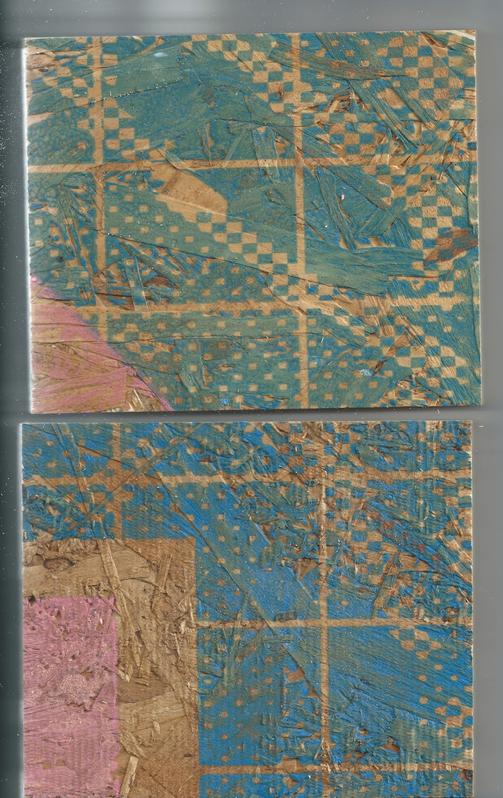


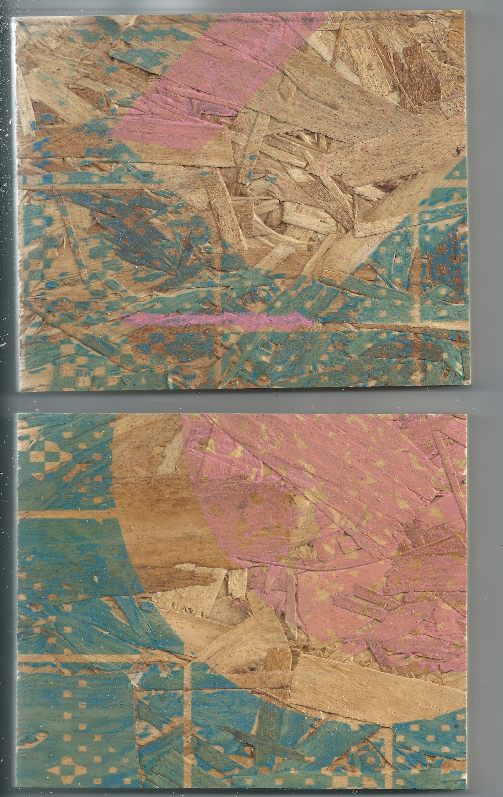


We created a few test prints to give out at an upcoming print workshop we are holding at Leeds Print festival, we will be taking the wood with us to show the different capabilities of screen printing and how it can be applied to paper and more robust objects.


No comments:
Post a Comment