Evaluations of Final work - Design Production
Based on a professional outlook on a more personal level I will review the final outcomes created in the Design Production module focusing on:
How they helped me progress in an informed direction within the branding sector of the creative industry I want to be placed within.
How cultural and target audience considerations were used throughout.
How cultural and target audience considerations were used throughout.
The consideration of an external & professional context & placement within the outcomes.
How they reflect my current design personality.
A key result from all this is the professional outcomes that can be used to begin making a portfolio for external recognition for freelance work alongside aiding employment.
Studio Brief 1 - My design process folded leaflet
The concept idea for the final outcome I created was a visual representation of how something appears simplistic from the outset and is often viewed by onlookers as unconsidered minimalist design with no real thought behind it. But infact it is made up of complex design stages to arrive at this final outcome.
The product I created makes use of 3 primary coloured paper stocks that represent the 3 main areas of the design stage (Research, Development & Final), bold and contrasting linear lines make up an abstract interesting aesthetic working with the shapes of the physical construction while creating a series of coloured triangles and squares that represent the more detailed design stages explained in a colour co-ordinated key. The square representing the final stage, the use of a square shows how the triangles/design stages all interlock to create this final outcome/final design.
The semi translucent strap shows a snapshot of the interior of the design through a swatched colour scheme and shape system.
When unfolded the construction shows an array of different shapes from different angles but when folded together all comes together to create a complete, structured and simplistic final outcome showing how all complex elements/design stages come together to create a deceivingly simple idea.


Informed PPP Evaluation
This brief was the first opportunity to reflect my design personality within a brief focusing on a folded leaflet. It allowed me to place something that is overlooked by people who view creative work as something quite "irrelevant" into something aesthetically pleasing and functional.
Allowing me to compile all my personal design process's into a concise format, it was a nice opportunity to create work that can be placed within the real world to start putting certain elements of my design practice into outcomes that can be reproduced externally.
My focus for this year is to enhance knowledge and skill sets within branding, although this leaflet wasnt an external brand image for an actual organisation it gave me the first opportunity and practice on how to place concepts into readable and understandable outcomes in a concise and precise way. An important skill in branding.
Studio Brief 2 - Logo for Whiskey Elements Kick-starter company.
Whiskey Elements are a company that sell a bespoke product that offers the buyer the opportunity to customize the taste of there whiskey through "whiskey elements". Pieces of wood with a range of flavors and characteristics that can create a 3 year taste enhancement in 24 hours making your average whiskey taste a great deal nicer.
There strap line for this product is Time & Oak so I used this as the main point of text for the logo and playing off the term Time & Oak provided the main influence of presenting a contemporary twist on traditional aesthetics.
The concept behind this versatile & customizable logo system was a simple one, to create a logo that expressed the company "Whiskey Elements" Heritage through a logo inspired by Portland Oregon's government seal & traditional whiskey branding aesthetics.
The aesthetic of the logo is one based on suggestive logos, the circular element can be interpreted as a birds eye view of a whiskey barrel outline as well as an icon inspired by the Portland Oregon seal, a way in which two elements of traditionally and heritage come together. One from the place of origin of the product and another based on the traditional production process of the whiskey drink. The use of sans serif typography comes from influence of traditional whiskey branding.
The products main promotion point is to customize the users drink, enhancing flavor and characteristics of the drink, to support this I created a logo system with a series of icons that allowed versatility and customisatiation depending on the logos positioning across the brand range, 12 variations are available in both black and outline versions.
Full project run down found here


Informed PPP Evaluation
This brief was a perfect opportunity to begin making work for a real external purpose with a focus on my interest in branding. It also allowed me to focus on a skill outlined by feedback by peers, conceptual design. Applying strong concepts to branding work for an actual organisation provided an invaluable learning curve.
It allowed me to consider the target audience and how to focus on there requirements when producing concepts and the visual productions of them.
This brief also allowed me to think of external production methods, an important skill for when producing work outside of education institutions with high end equipment. Looking into conceptually relevant production techniques; Laser cutting, Stamp making, digital print and print finishing was what was focused on here using in house equipment.
But setting up PDF files with packaged ASE colour swatches for accurate reproduction for external printers was one focus.
How to set up files in illustrator and how to colour code for "cutting modes" if it was to be sent to an external company.
Stamp making was created using laser cut but this is a technique commonly used anyway so this was also considered.
Print finishing in the form of metallic edging on the business cards would most likely have been the more expensive finish used in the project making me consider project budgeting for future external work.
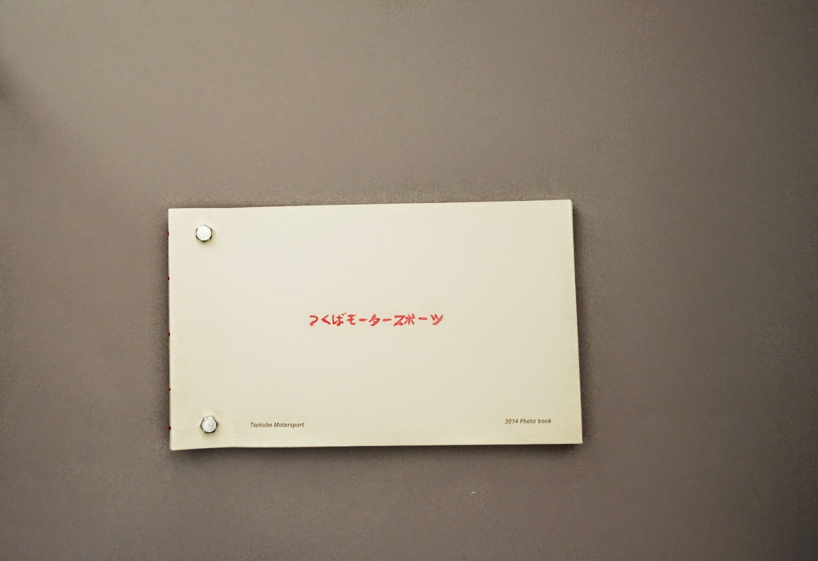
Studio Brief 3 - Website for Tsukuba Motorsport Automotive blog
Here are my final website designs aimed at a Motorsport enthusiast target audience, in this specialising on Japanese Motorsport & Engineering.
The website name Tsukuba Motorsport takes its influence from the famous Tsukuba circuit in Japan were internationally renowned events Drifting & Time Attack originated from. The Japanese logotype is Tsukuba Motorsport in Japanese, the glyphs where designed around a grid system I created from an outline of the Tsukuba Circuit and the Japanese flag to keep things relevant to the origins of Japanese Motorsport.
I created a supporting GIF animation translating this Japanese logotype for the home page, the motion path the animation follows is based around a grid system that came from a Clock face and the european flag, the idea of using the clock face comes from the main concept of Time Attack been a race against the clock, the idea of using the european flag shows unity through the nations that helped make these Japanese Motorsport's internationally recognized.
The main focus of the site was to present high quality images of various aspects of Japanese motorsport to meet the end users main desire to view lots of image content.
This was carried out through a website aesthetic inspired by traditional Japanese artwork in its aesthetic and color combination. The structure and layout of the site & content took a minimalist and structured format inspired by the technical innovation, attention to detail and accuracy seen in Japanese car engineering. This was achieved through the contrast of a clean small pt sans serif typeface and large high quality imagery within the vast amount of white space while maintaining an element of structure within the placement of the website content, this in combination with short snappy elements of typography and a limited color palette kept focus on the imagery with no visual distractions within the hierarchy of the site.
Full project run down found here


Informed PPP Evaluation
This brief allowed me to expand on conceptual thinking, applying it in considered ways relevant to target audiences and taking influence from historical and contemporary sources highlighting how important primary and secondary research is to enhancing my creative practice.
Expanding on this consideration to target audience made me think of how to reach out to as many target audiences as possible through enhancing recognition through focused photography social media services like Instragram, to device output by creating a responsive website that works across all devices and has a defined phone website. The instagram account is something that will be pushed for further external recognition.
Studio Brief 4 - Augmented Interactive campaign for Tsukuba Motorsport
The intention of this advertising campaign was to extend on an existing website I created in an interactive way. An automotive blog influenced by Japanese motor sport & cars and focusing on high quality imagery with little textual distraction. Eye candy for automotive fans. I took forward elements of structure, minimalism, accuracy and movement from the website along with familiar aesthetics to keep things consistent across the brand image.
From this I created a physical advertising campaign taking supporting influence from the website with additional consideration to use of materials and process's to emulate Japanese engineering and traditional Japanese craft, from this I reproduced a refreshing line of promotional products and merchandise that sways away from the usual garish and tacky automative campaigns.


Branding is about covering all areas for recognition and attracting strong customer response, and often means expanding the brand image across a strong range of collateral. This brief allowed just that, extending on the Automative blog that I started and producing work that can reach out to more target audiences and also begin to promote and market the website and services Tsukuba Motorsport offer.
Interactivity Apps also took consideration into current digital trends, merging these with traditional print process's with strong conceptual consideration resulted in covering lots of design production methods to arrive at a good range of advertising and brand collateral.
The concepts and production methods within the website and the extension with the branding influenced advertising campaign took into account cultural influences to help create a refreshing output that differs from existing automotive websites, giving my work some good external recognition for innovative graphic design within the automotive sector. Bringing something new to the table is a great skill to have that will aid my professional practice.
No comments:
Post a Comment