Thursday 15 May 2014

OUG402 PPP module evaluation

OUG402 PPP module evaluation  

BA (Hons.) GRAPHIC DESIGN
LEVEL
04
 Module Code 
OUGD402               


 Module Title
PPP1


END OF MODULE SELF-EVALUATION

NAME
Johnathan Pell


1.  What skills have you developed through this module and how effectively do you think you have applied them?

Having already been someone who visits lots of exhibitions to inspire my practice PPP gave me opportunity to do something I enjoy and contextualise it and link it to my work more effectively. It has also helped me notice the general goings on in the creative industry.

I have developed my personal confidence a little, reaching out there and contacting designers beginning to create relationships with them that may benefit me further down the line when it comes to placements.

My awareness of the creative industry has developed, having very little knowledge of the goings on in the creative world thins like blogs and contacting designers have helped me stay up to dates with things like exhibitions and up to date current design styles.


2. What approaches to/methods of design production have you developed and how have they informed your design development process?

Recording visits has been something I developed, I’m used to using the blog as a means of recording inspiration and development work but using it to document actual goings on in the creative world has added an extra element to my collection of resources to look back on.

Conceptual thinking, my conceptual thinking has developed even more. Been a designer who considered aesthetics more instead of concepts I created some work to demonstrate this change so I had to be very conceptual in the ideas generation and development of my design resolution for the “its up to you brief”

Contacting people is something that has also influenced my practice been pointed in the direction of exhibitions and in turn these exhibitions providing with a lot of design inspiration.

Finishing of work and photographing of work, I have considered the presentation of my work when it comes to photographing print based media as it strengthens the overall appearance and quality finish of the resolution. I have also carried onto consider stock choice and construction and format elements to keep things relevant to my personal manifesto and keep things conceptually relevant.


3. What strengths can you identify in your work and how have/will you capitalise on these?

Conceptual thinking, carry on considering every aspect of the design process to create more considered and developed design resolutions.

Cary on contacting designers to become known a little more and gather a bank of contacts to stay in touch with to help me gain placement opportunity’s and stay in touch with the happenings within the creative industry.

Keep been ambitious, I have sent off work to Adidas and this is quite an ambitious move in itself. Carry on making big moves like this but with better design resolutions, take big risks to open up big opportunities.

Stock consideration, been a print based designer I have really considered this element a lot within the design process of the its up to you brief. Stock colour, weight and texture can all change the aesthetics of a design resolution and alter things like readability & legibility so I want to carry on considering all these type of factors to create higher quality design outcomes.


4. What weaknesses can you identify in your work and how will you address these in the future?

I need to contact more designers; I have only been in contact with one designer in terms of having a real conversation. I need to be more persistent and keep trying to contact more designers and consider how I word my conversations with them to aim at getting a response.

Time management, this usually isn’t an issue but for this module I have rushed a lot of my physical work. I feel I could have created a stronger final outcome for the its up to you brief with more ideas consideration and better development If I managed my time more.

Research, I didn’t really carry out much research for my concept and visuals for this “its up to you brief” carrying out more thoughtful research will create stronger outcomes in the long run.

Confidence, when contacting designers and reviewing my own work I am really doubtful with it. I always think the worst, when contacting designers I just think there not going to reply and this probably reflects in the messages I send them. I need to be more confident and consider what I’m saying to them a lot more. Same with reviewing my work that I plan on sending out to people, I am aiming high but there’s no need to accept defeat so easily.


5. Identify five things that you will do differently next time and what do you expect to gain from doing these?

Consider use of language when contacting designers. Don’t be so formal as this bores them and reduces the chances of getting a reply, be more brief and to the point and I may get reply’s more.

Visit the list of studio websites john sent us to begin contacting designers further a field to carry on my ambitious aims.

Manage my time better to create better-developed design outcomes.

Consider different print techniques rather than just going with the safe digital print option, I have gained good results with screen-printing before I could have benefited with using that this time to use some white ink in one of the designs I created to maintain better readability & legibility on the dark blue background through stronger contrast of tone.

Consider typeface design a little more, I only made 2 glyphs for the design but It would have been nice to create a full type specimen to work alongside my “information pack” to show my development within type design in my creative practice.


6.How would you grade yourself on the following areas:
(please indicate using an ‘x’) 

5= excellent, 4 = very good, 3 = good, 2 = average, 1 = poor

1
2
3
4
5
Attendance


x
Punctuality


x

Motivation


x


Commitment


x

Quantity of work produced


x


Quality of work produced


x


Contribution to the group


x
The evaluation of your work is an important part of the assessment criteria and represents a percentage of the overall grade. It is essential that you give yourself enough time to complete your written evaluation fully and with appropriate depth and level of self-reflection. If you have any questions relating to the self evaluation process speak to a member of staff as soon as possible.

A-B Information pack for "Its upto you brief"

A-B Information pack for "Its upto you brief"

Here are my final photographs of the outcome for the "Its upto you brief". Its an idea based on a resolved information pack. 

The main concept is based on how I have changed from the beginning of the year to now, simulated through an interpretation of the common quote "from A-B" based on the traveling of one point to another. Its a round up of my journey in a before and after type of snapshot. The red dots and lines visualise this point to point sort of journey in a clean and accurate way which works with the rest of the

Design and concept influences stemmed from my presentation and my manifesto. The content explains a before and after snapshot of my creative practice, the content derived from my presentation. 

The construction is a fold that incorporates a square and a rectangle to simulate the structure and use of grid I use within my working practice now. This same use of grid, consideration to layout, use of space and structure is simulated in the design layout. Quite minimal and lots of negative space demonstrate my minimalist nature.

The use of stock came from my manifesto mentioning on how I prefer to create designs for printed media and consider my paper stock choice. I liked the contrast I created through the duplexing/joining of 2 paper stocks. 

The A & B glyphs aesthetics are based on a stippling technique I used when I used to create very illustrative image based type design, it shows the journey and how its changed from analogue/traditional to digital and accurate within the structured repetition of the dots. 


Im liking the sense of movement on this section of the design, the horizontal line and the red "point to point" system keeps the eye moving across the page simulating a journey even more. 

I struck out my name on this page as this is the page that contains the content information on what kind of creative I used to be, striking it out simulates how I am not like that anymore. 


Here are my other 2 colour variations photographed in better light.

Wednesday 14 May 2014

"Its upto you" brief ideas, development & production

"Its upto you" ideas, development & production

I began figuring out an idea for what to make for studio brief 2, "its upto you".

I saw the brief as an opportunity to reflect on the year, and my presentation so after having a think on the main concept behind it I decided on showing a snapshot of a journey in a before and after timescale. This would allow me to cut all the bits out I presented in the presentation and basically provide a brief yet concise explanation of what type of creative I am now compared to how I was before.

I began trying to figure out how to show a before & after journey, deciding on a 50-50 split in terms of content and how it will all be put together, nice and simple. Before content, and after content.

I began thinking of the key things that i mentioned in my presentation that have significantly changed for me. To show this journey I want to provide a snapshot of a before and after based on the common term "from A-B" which describes traveling from one point to another. 

This consideration to a concept before actually creating work demonstrates how I think about concepts rather than aesthetics. Were as before I just went with my first idea and concentrated on making it look "nice" and aesthetically pleasing. 

One idea at the moment to incorporate something that defined me at the start of the year and what defines me now in a visual output is to create a glyph for A & B, A would be using traditional image making mediums, linking back to how I was an image based, illustrative creative who used traditional mediums. The B glyph would be made digitally to visualize my transformation of style.

The format would be quite square to visualize my structure within my layouts and my consideration of grids learnt through design principles. I like the idea of the flip card or something that fold out to reveal hidden information (information on my style before the year started for example)

Began mocking up how it would look, the type elements will be very simple, Its going to be tricky to align the hyphen up when the pages are folded but if I'm successful it will help solidify my structured consideration within my use of grid and layout which is now a set rule through most my work.

Using a type of fold aloud me to hide the characteristics I used to have and just present the new characteristics I have while still allowing the A and B to sit next to each other. 


But when folded out showed were I was before, the horizontal extended hyphen/line simulates a sort of timeline and shows progression leading the eye across the page and back to the front cover showing "B" content. 

I began illustrating my "A" glyph using a style of drawing called stippling, something I used back in foundation when I created a full A-Z "bone typeface". This allows me to link back to the creative I used to be when I had no idea about proper typography design so this amateur attempt will work alongside & contrast against the more considered, clear, and considered digital B i create. 

Inspiration

Resolution

Sort of the style the B could be taking forward the "stipple" dots into a more clear, concise and structured outcome using digital techniques to show a visualisation of a journey of style within 2 contrasting glyphs. 

Playing around with more abstract and unique glyphs to show my old illustrative style been incorporated with digital techniques. But I want the glyphs aesthetics to stem from the A somehow. 


Now to digital production, In adobe illustrator taking forward the dots used in the stippling and producing a structured digital outcome. 

Just the 2 glyphs next to each other work well, a nice contrast but not sure how there going to work when placed in conjunction of the layout with body copy etc.

I also created a digital A just incase the traditional A doesn't work in the layout. I hope it does though as the traditional medium shows a journey much better. 

Removed the slight angle within the crossbar as it looked more like a manipulated 8 rather than an A and has a more structured solid feel allowing the glyph to sit flush onto the baseline. 

Trying out different sized circles to make up the Glyphs, small circles really hurt my eyes and make the glyphs quite illegible.

Medium weight dots helped a little but still prefer the heavier weight dots.
 Taking forward the visual research of the design work I appreciate and inspires me now in the previous post I created a digital mock up of the rough hand drawn idea I created, really liking this but it looks far too empty. I know I said I have things minimal and simple but this looks rushed, and too much space leaves the body copy and other elements feeling lost within the negative space.


As I feared though I don't like how these glyphs work together, not keen on the contrast of mediums looks like a miss mash of visuals, I think its the body copy that ruins it, 3 different styles of typography within such a small surface area really goes against my morals of simple, clear design. 

Much more considered.

Stretched out the body copy to take up more of the space, works much better now making the most of the negative space and not feeling as lost as it sits up and feels locked into the horizontal line running across the page. 

Taking forward a fundamental element, the "dot" that came from my old favorite drawing technique "stippling". I created a background for the back of the construction so it didn't feel empty and added a nice visual spark to the whole design.

I wanted a strap to hold the folded construction together, I'm really not liking these bands thought they look so garish and bulky and ruin the clean cut, minimal aesthetic of the design. Maybe if the format size was a little bigger it would work but due to the small size its too rustic and garish. 


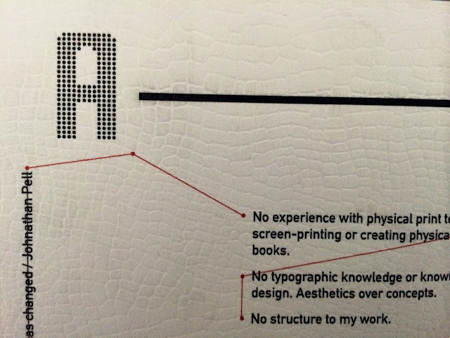
To take up the space on the "A" page I devised a sort of point to point system to visualize a map/locations more which has relevance to my concept of displaying a journey of how I have changed in an A-B sort of way. 

Began taking my test prints into physical production, I chose some shades of blue to play around with. Been quite a personal design I though for the stock choice I may swell chose my favorite color. The red point to point system is my second favorite color and also works well alongside blue.

I like this example for its contrast within the the body copy, the black contrasts nicely and allows very good readability. But the shade is a little childish I feel, I want something a little more toned downrather than something that looks bold and loud. 

My favorite color combination, I love the antique off white and the dark blue tone they work together beautifully but the typography is far too illegible and unreadable. This was my last piece of this antique white kind of stock too so I can't even take this into the other color tests.

This shade of blue is perfect, in-between the above 2 shades its the perfect balance of light and dark. Im willing to sacrifice the more subtle contrast in body copy as the type is still readable enough. The contrast of texture between the blue and white stock is amazing too, the white has a leather like texture and the blue a smooth matte texture. This contrast of texture (rough & smooth) is a happy accident really, the texture on the white has a more traditional feel too it which has relevance with the content on that page describing my traditional creative style at the beginning of the course. 

Obvious link back to the OCD attention to detail I mention in my presentation. Making sure the pages are perfectly stuck together and no overhanging edges for a perfect professional finish. 

My 2 favorite colors, I like the idea of paper clipping the productions shut but It does look a little garish, it has a certain mechanical/rawness too it though which works nice with the whole minimal aesthetic and the yellow contrasts perfect creating a good overall color scheme. 

Still to try an elastic band I feel this will work better. 


The inside cover is my favorite bit, to strengthen my conceptual thinking that I have developed I feel the addition of these visuals that represent a point to point system really do strengthen the whole concept of my journey "A-B" in a simple and concise way not causing unnecessary visual confusion a nice subtle element that made use of the amount of negative space but didn't make it feel to busy and cramped.

Need some better photos but I mentioned in my manifesto with Niel about me considering paper stocks so I saw this design outcome an opportunity to bring back this consideration into my print based design solutions I like to create. I love the leather like texture it gives a crisp white stock a little more character which works well alongside the minimal and clean aesthetics. 

I struck my name out on this page to represent how this was me before and how Im no longer like what it says on this page. 


I will take some better photos with better lighting to show the detail of the construction.